Website Redesign Examples: What Changes and Why It Works is a practical guide that explains what “redesign” really means (beyond colors), what typically changes in successful before/after redesigns, and how to run a redesign project with a clear checklist—whether you’re targeting users in Jordan, the GCC, or globally.
What is a website redesign (and what it is not)?
A redesign can be one of three levels:
Visual refresh
-
Updates typography, colors, spacing, components
-
Keeps the same structure and content mostly unchanged
UX/structure redesign
-
Rebuilds navigation, page structure, and content hierarchy
-
Improves conversion paths (contact, booking, checkout, inquiry)
Replatform / rebuild
-
Moves to a new stack/CMS (or major backend change)
-
Often includes performance, security, and scalability upgrades
Tip: Most “successful redesigns” combine UX/structure + performance (not visuals alone).
When you should redesign your website
Common signs your site needs a redesign:
-
Mobile experience feels cramped or slow
-
Users can’t find key info (services, pricing, contact, location)
-
High bounce rate on landing pages
-
Low conversion (forms, calls, WhatsApp clicks, purchases)
-
Content is outdated or poorly organized
-
SEO traffic dropped or pages don’t rank for main services
-
Site is hard to maintain (old theme, broken plugins, messy code)
Website redesign examples (patterns that repeatedly work)
Instead of naming brands, these are the before/after changes that drive results in real redesigns.
Example 1: Navigation and structure overhaul
Before
-
Too many menu items
-
Important pages hidden
-
Users get lost between sections
After
-
Clear top navigation (5–7 items max)
-
Services grouped logically
-
Contact/action always visible
-
Better internal linking between related pages
Example 2: Pricing/services clarity and faster decision-making
Before
-
Users scroll a lot to understand what you offer
-
“What’s included?” is unclear
-
No quick comparison of options
After
-
Clear service sections with bullets (what you get)
-
Short “how it works” flow
-
FAQs near decision points
-
Less scrolling to reach the important info
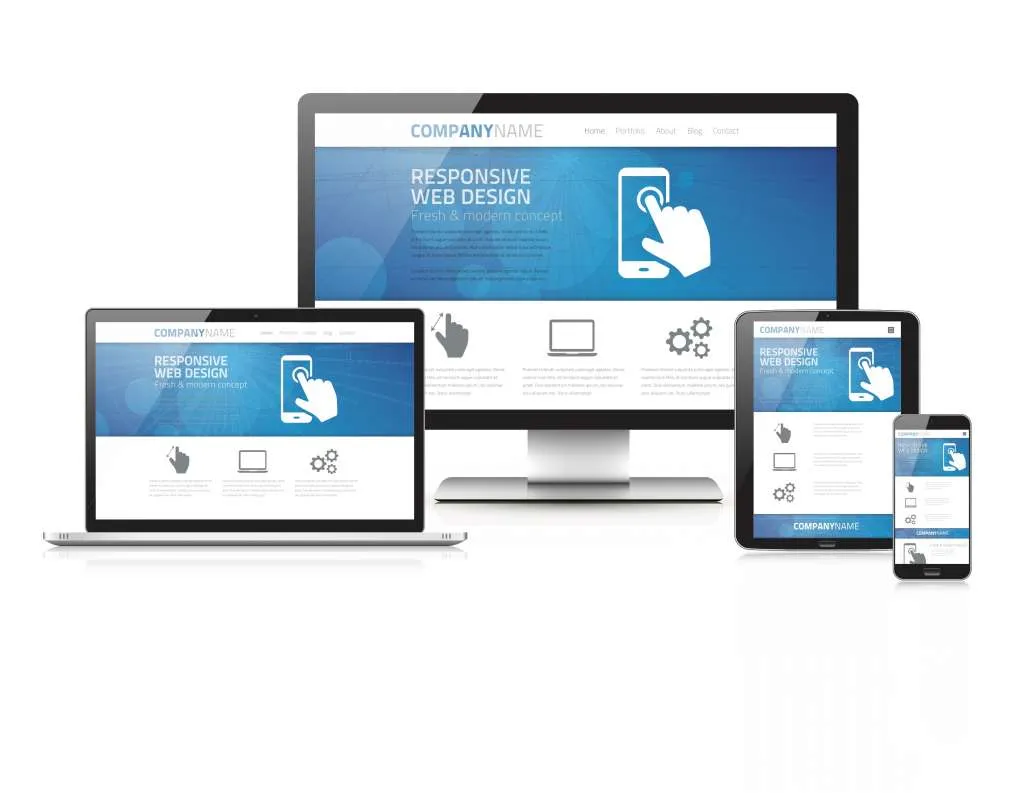
Example 3: Mobile-first redesign + speed improvements
Before
-
Heavy images, slow load, layout shifts
-
Buttons too small, forms too long
After
-
Faster pages (compressed images, optimized assets)
-
Bigger tap targets, shorter forms
-
Sticky call/WhatsApp (when appropriate)
-
Cleaner layout that works on phones first
Example 4: SEO-focused content restructure
Before
-
One long page trying to rank for everything
-
Repeated text across pages
-
Weak headings
After
-
Separate pages for core services (each with clear intent)
-
Strong H1/H2 structure and scannable sections
-
Internal links between service pages and guides
-
Cleaner URLs and improved meta titles/descriptions
Example 5: Brand consistency via a simple design system
Before
-
Inconsistent buttons, fonts, spacing
-
Pages feel like different websites
After
-
Unified components (buttons, cards, forms, icons)
-
Consistent spacing and typography scale
-
Same style across all pages and devices
Website redesign checklist (step-by-step)
Step 1: Audit before you redesign
-
Identify top pages by traffic and by conversions
-
Review what users search for (site search + top landing queries)
-
Check speed (mobile performance matters most)
-
SEO audit: indexed pages, broken links, duplicates, thin content
-
UX audit: where users drop off (forms, checkout, contact)
Step 2: Define the goal and KPIs
Pick 1–3 measurable goals:
-
More leads (form submits, calls, WhatsApp clicks)
-
More sales (checkout completion)
-
Better engagement (time on page, lower bounce)
-
Better SEO performance (rankings, organic sessions)
Step 3: Rebuild structure (information architecture)
-
Sitemap (what pages exist and how they connect)
-
Navigation plan (simple and consistent)
-
Prioritize “money pages” (services/contact) and “support pages” (guides/FAQ)
Step 4: Content rewrite (clarity first)
-
Rewrite intros and key sections to be scannable
-
Add FAQs where users hesitate
-
Reduce fluff and highlight decision info (what, who, how, timeline, requirements)
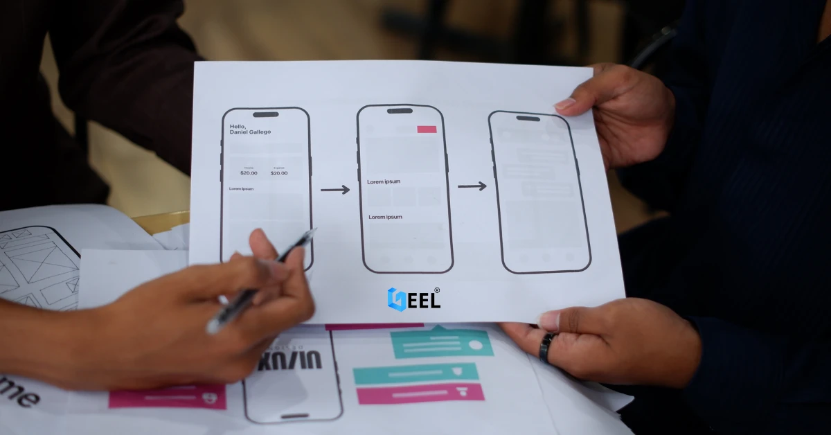
Step 5: UX/UI design (prototype first)
-
Wireframes → clickable prototype
-
Validate main flows: find service → understand → contact/checkout
-
Design mobile screens early (don’t “shrink desktop” later)
Step 6: Development and technical upgrades
-
Clean code structure and reusable components
-
SEO essentials: titles, meta, headings, schema where relevant
-
Performance: image optimization, caching, minimized assets
-
Security basics: HTTPS, updated dependencies, safe forms
Step 7: Pre-launch QA
-
Test on Android + iPhone
-
Test forms, emails, WhatsApp, maps, and tracking
-
Check 404s, redirects, and internal links
-
Validate page speed and layout stability
Step 8: Launch + post-launch improvements
-
Monitor conversions, rankings, and errors for 2–4 weeks
-
Fix drop-offs and update weak pages
-
Keep improving content based on real user behavior
Common mistakes to avoid
-
Redesigning visuals without fixing structure and conversion paths
-
Changing URLs without proper redirects (hurts SEO)
-
Launching without testing forms and tracking
-
Creating one page that tries to rank for every keyword
-
Ignoring mobile performance and accessibility
FAQ
Does redesign always mean rebuilding the site?
No. Sometimes a UX restructure + performance optimization is enough without changing the platform.
Will redesign improve SEO automatically?
Not automatically. SEO improves when redesign includes better structure, content intent, internal linking, speed, and clean technical setup.
How often should a website be redesigned?
Minor improvements can be continuous. A major redesign is usually needed when structure is outdated, performance is poor, or the brand/service offerings changed.
Related internal link
Website Design & Development in Jordan & GCC


.webp)
.webp)


.webp)


.webp)